I don’t know if you see a pattern between the title of this post quoting the Pet Shop Boys, my previous post where I did a little (and probably not that good) Haiku with a reference to map and tea and what you will find in this post but I hope that by the end of your reading you will.
As the idiom goes, a picture is worth a thousand words. This is what had bothered me when I looked at the FAO data, splitting the world of tea into two categories: the Old World and the New one. If you don’t remember this post, its conclusions were that unlike in the wine industry, there was not a big reversal of production in the tea producing countries (but perhaps interesting developments going on in terms of diversity of producers).
But let’s get back to a picture is worth a thousand words. I am lucky to have at work two people working on our Geographical Information System, which for those who don’t know about it is according to Wikipedia “any information system that integrates, stores, edits, analyzes, shares, and displays geographic information. GIS applications are tools that allow users to create interactive queries (user-created searches), analyze spatial information, edit data in maps, and present the results of all these operations.”
Those two people were friendly enough to help me to refine my needs and helped me find a way to present to you a visual representation of these data.
So you will find below a representation by decade from the 1960s to the 2010s (with the data ending in the year 2014) of the tea producing countries in the world and for each an average of the yearly production of each country during these 10 years. Even if it doesn’t always mean much, I thought it was as good as anything else to represent how much each country weights in the tea world. For more details, just click on the link below each map.
Tea producing countries from 1961 to 1969
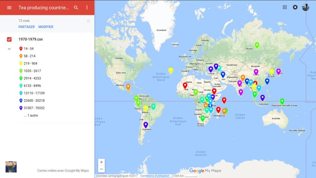 Tea producing countries in the 1970s
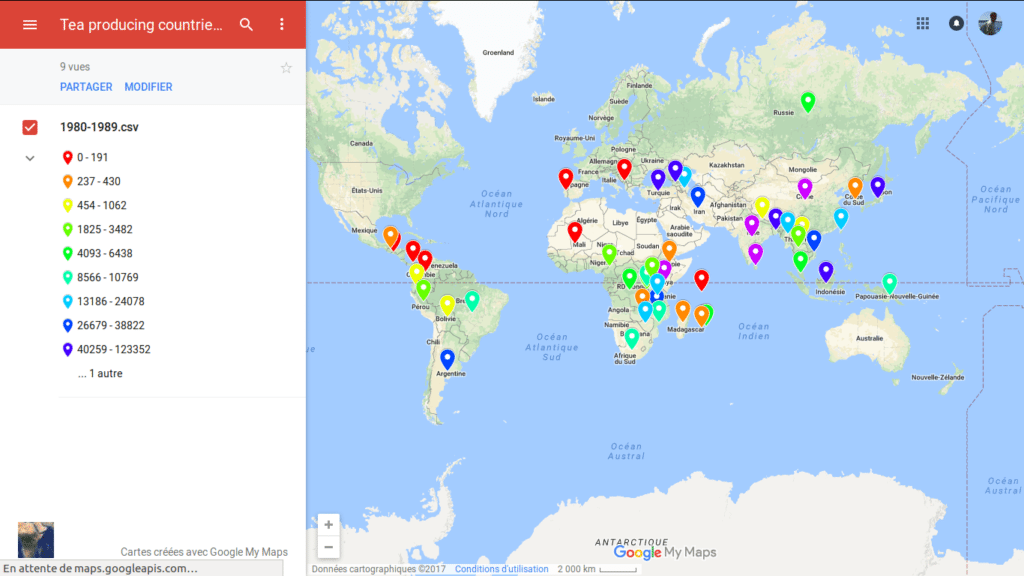 Tea producing countries in the 1980s
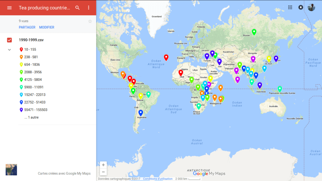 Tea producing countries in the 1990s
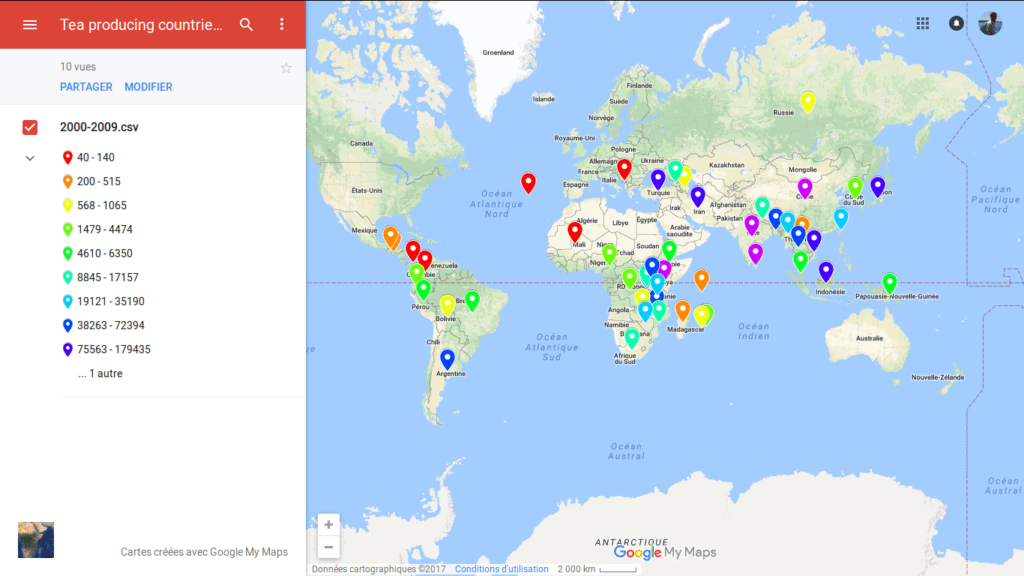 Tea producing countries in the 2000s
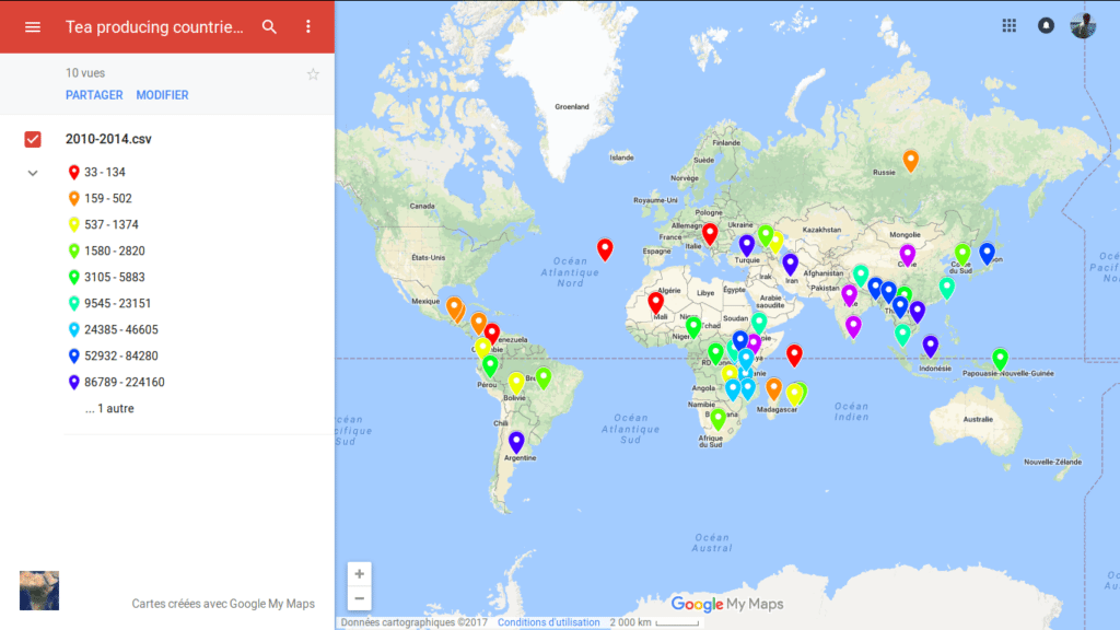 Tea producing countries between 2010 and 2014
What can we learn?
First, that there are over these 50 years only a few new producing countries. I am still undecided whether or not this is true or linked to a problem in the way the FAO collects its data. If you see any country missing on the maps, do tell me and I will look further on.
Second, we can now visually see the rise and decline of some countries in terms of their yearly average production through each decade, something which might be of interest for later investigations.
Third and most important for me, we can now see the 3 main producing blocks in terms of number of countries located on three different continents (the South of Asia, the centre of Africa and South America from North to South) with some more exotic spots around them. It might be obvious to some of you but although I had all the data available, I had no idea that so many countries produced tea until I saw it
And what are your thoughts on these maps? Did they bring anything to you?

I was intrigued to see Papua New Guinea made the list. The seeds that started their industry came from India via Brisbane: now they are 25th in the world and Australia is not top 50!
I didn’t know that. Do you have more info on it?
Bonjour,
En tant que conseiller technique pour la réalisation des cartes, je ne peux que me féliciter
de constater que cela a bien fonctionné.
Longue vie à ce blog du thé dans le monde
JM
Hello,
As a technical advisor for the realization of the cards, I can only congratulate myself
to find that it worked well.
Long live this tea blog around the world
JM
Bonsoir Jean-Marc,
Merci pour ton aide et celle de Laurent et merci pour tes voeux de longue vie à ce blog.
Hi Jean-Marc,
Thanks for your help and Laurent’s and thanks for your long live wishes for this blog.
This is seriously great work, as always, Xavier. I’m quite surprised Australia doesn’t have a “tea flag” on it, though.
In a follow-up to your Papua New Guinea dialogue, here’s a tea/coffee garden I know about.
http://www.highlandsarabicas.com/madanplantation.html
Thanks @lazyliteratus
As for the data, as you can guess, it is not mine and I will try to dig into it to understand how it was made or why some countries are missing (the USA are another example).
I have some ideas but I prefer to double check them.
🙂 Nice
I did not realize that South America is becoming a serious producer. Has anyone tasted tea from there? And if so how was it…?
Thanks.
I knew Argentina was one as I saw them at the Brussels tea expo a few year expo and I talked with them but I didn’t try any yet.
Many more flags needed on the map – Australia, New Zealand, UK just three and there are plenty more. Look out for new book “Jane Pettigrew’s World of Tea” naming every tea grower in the world, and some fascinating new places. I write this comment from Hawaii where I am helping to set up a new tea cooperative.
Thanks for your comment.
I still have to figure out how these official data sets were gathered and done.